Let’s explore some real-world data to see how much electricity wind turbines generate compared to what we use.
Electricity Generated (by Wind)
This graph shows how much electricity was generated by wind turbines across the U.S during the week of Nov 15-22nd.
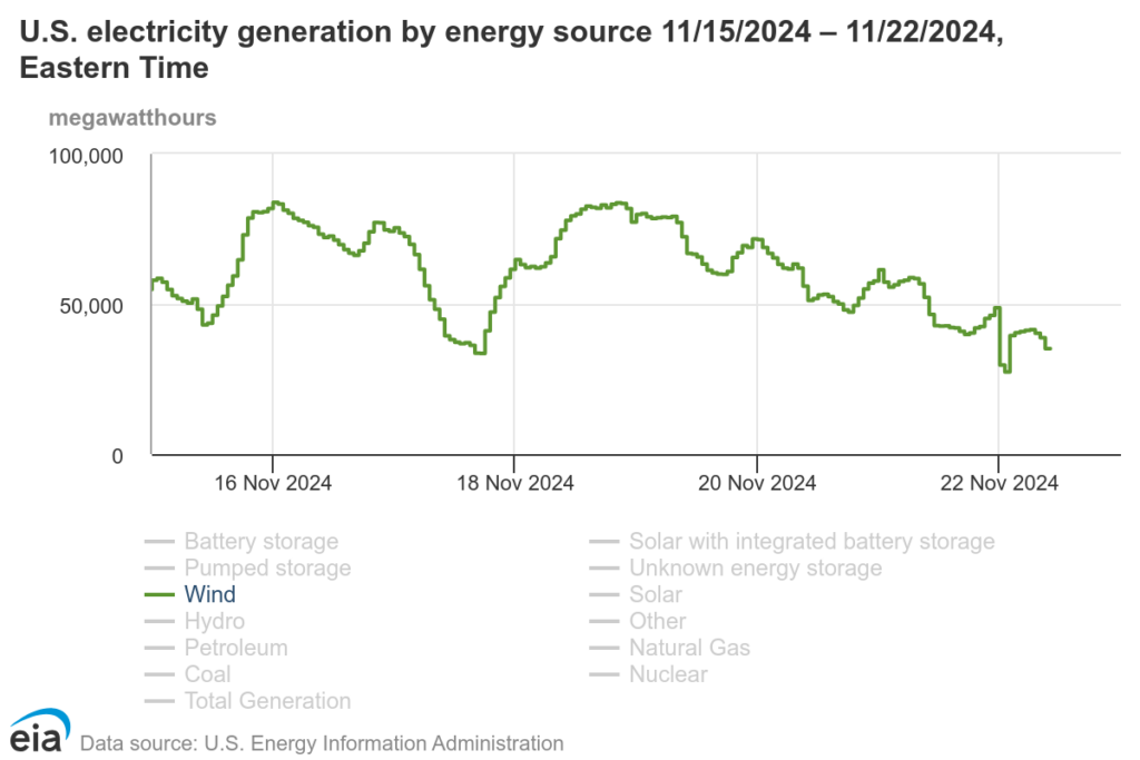
Notice how the amount of electricity generated changes over time. What do you think causes these changes?
Energy Demand
This graph shows how much electricity was used across the U.S. during the same week.
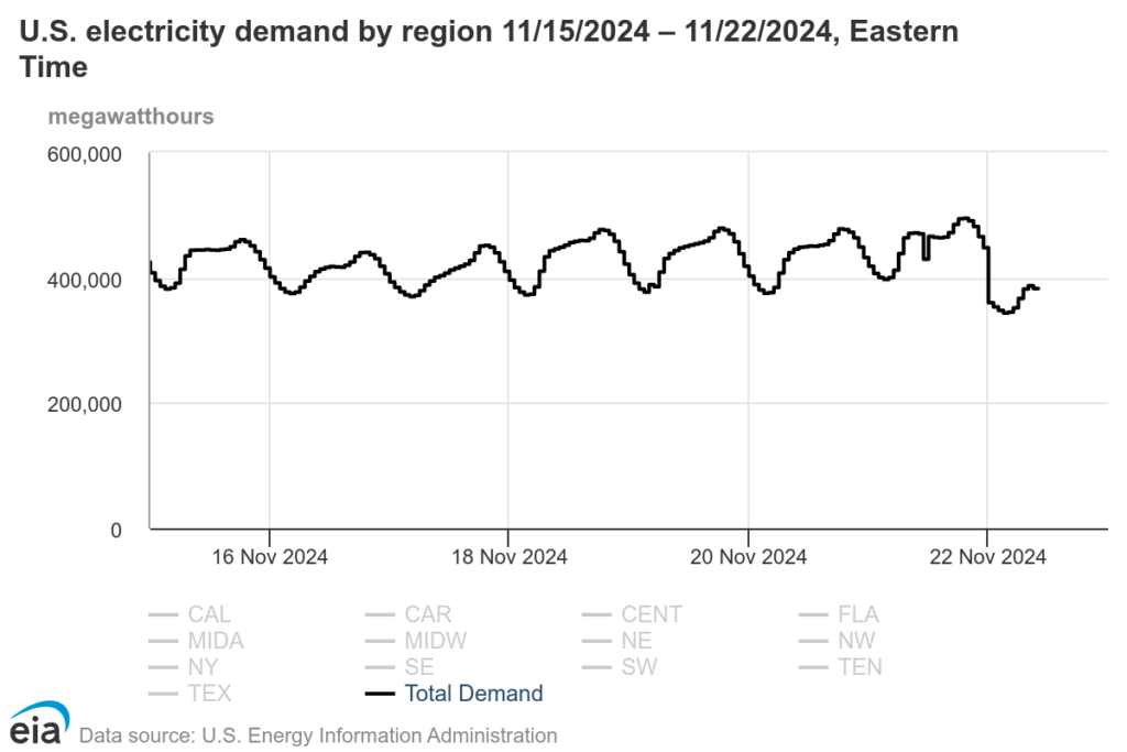
Can you spot the peaks (when people use the most electricity) and valleys (when they use the least)?
THINK, PAIR, SHARE
- How much electricity are people using compared to how much is generated by wind?
- What problems do you see when comparing the two graphs? How might we solve these problems?